Content Manager Documentation
This documentation showcases each component and the varieties that it’s able to achieve. Every component has its settings (colours, themes, font size, etc) that could be adjusted according to your needs.
P.S. Any theme that are not mentioned in this documentation is currently unused, unless they’re needed for future improvements. Choosing these themes won’t break the page - just produces plain style.

Banners

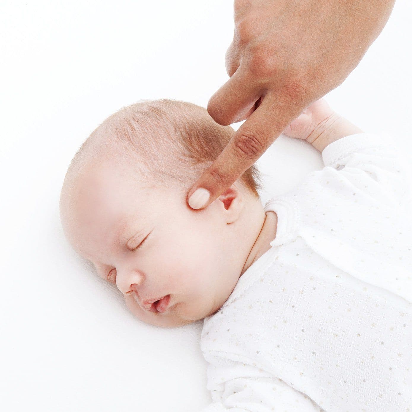
Banner - Theme 1
Content width set to 75%.
On smaller screen view, image stacks above the content.
Ensure content aligns and fits within the background image area.
Buttons have a 2rem top margin.
White text in the banner switches to a dark color on smaller screens for better readability.
Banner - Theme 1
Banners with no background images.
Content aligned left.
製品についてのお問合せ、お見積りや資料をご希望の方はお気軽に下記フォームに必要事項をご入力の上ご連絡ください。担当者よりご連絡させていただきます。 製品についてのお問合せ、お見積りや資料をご希望の方はお気軽に下記フォームに必要事項をご入力の上ご連絡ください。担当者よりご連絡させていただきます。

Banner - Theme 2
In Theme 2, content width is set back to 100% (full width layout).
Content aligned center.
Banner - Theme 2
In Theme 2, content width is set back to 100% (full width layout).
Banners with no background images.
Content aligned center.
製品についてのお問合せ、お見積りや資料をご希望の方はお気軽に下記フォームに必要事項をご入力の上ご連絡ください。担当者よりご連絡させていただきます。 製品についてのお問合せ、お見積りや資料をご希望の方はお気軽に下記フォームに必要事項をご入力の上ご連絡ください。担当者よりご連絡させていただきます。

Banner - Theme 3
Theme 3 features a full-width layout with the background image curved at the top-right corner. When the content is left-aligned, it only occupies 60% of the space on large screens for better composition.

Banner - Theme 4
Theme 4 uses a half-width 50% content layout on large screens, a rounded top-right background image, and applies a subtle white glow to accent or dark text for better readability.
- Content width: 50% on large screens
- Text glow effect applied to accent and dark text for better contrast
- Background image curved at the top-right corner
Content blocks
Contentblock Theme 1
All content items are aligned to the top vertically.
This column content alignment is set to left.
This column paragraphs use small text size and primary text color.
また、欧米の国際規格に準じた製品をいち早く日本のお客様にご紹介し、最適なソリューションを提供することを使命としています。
On mobile view, the layout becomes responsive by stacking the columns vertically — placing the image column on top, followed by the text + multiple content column.


Contentblock - 2-Column Layout (Theme 2)
All content items are vertically centered.
This column content alignment is set to Left.
This column paragraphs use medium text size and the primary color.
Contentblock Theme 2
All content items are vertically centered.
Content alignment is set to center.
Horizontal alignment can be set Left, Center, Right.
Contentblock Theme 2
Theme 2 (layouts 3, 4, and 5): Columns are spaced closely together with a small gap between each content item.

Images are automatically resized to fit their column, no padding. Followed by text or buttons, a 2.5 rem gap is added between them.

Text blocks occupy 80% of the column width.


Contentblock - 2-Column Layout (Theme 3)
The container width adapts to the content.
Buttons inside text columns have extra spacing above them.
The first and second columns get extra side padding for balanced spacing:
- Left column → more left padding
- Right column → more right padding
Contentblock - 2-Column Layout (Theme 3)
The container width adapts to the content.
Buttons inside text columns have extra spacing above them.
The first and second columns get extra side padding for balanced spacing:
- Left column → more left padding
- Right column → more right padding
(↑ 4rem top)
Theme 4 for content blocks uses a full-height, evenly stretched layout with responsive spacing — tighter on mobile and roomier on larger screens.
(↓ 4.8rem bottom)
(↑ 4rem top)
Theme 4 for content blocks uses a full-height, evenly stretched layout with responsive spacing — tighter on mobile and roomier on larger screens.
(↓ 4.8rem bottom)
Buttons
Buttons - Small Size
Buttons - Medium Size
Buttons - Large Size
Typography
And this is how a regular paragraph looks like. You can also adjust the sizing and the colors too, just like the heading ones.
そして、これが通常の段落の見た目です。見出しと同様に、サイズや色も調整できます。
Und so sieht ein normaler Absatz aus. Sie können auch die Größe und die Farben anpassen, genau wie bei den Überschriften.
This is extra small size, accent color
世界、こんにちは
Streichholzschächtelchen
This is small size, primary color
世界、こんにちは
Streichholzschächtelchen
This is medium size, secondary color
世界、こんにちは
Streichholzschächtelchen
This is large size, accent color
世界、こんにちは
Streichholzschächtelchen
This is extra large size, primary color
世界、こんにちは
Streichholzschächtelchen
Heading
MB11 ベラフォン(BERAphone®)による自動 ABR検査:ヘッドホン一体型電極
Verkaufsberatung
Durch unsere langjährige Erfahrung und unser breites Produkt-Portfolio von klassischen Audiometern über Schwindeldiagnostik bis hin zu Datenbanken finden wir für Sie die passende Lösung. Wir vertreiben nachfolgende Marken:
Diatec offers a complete range of audiological and balance solutions
Being an authorized dealer of several leading diagnostic brands, you only have to look one place to find the instrument that suits your needs. Based on many years of experience in the industry, we can help you find the instrument that that fits your needs.
Do you have any questions?
Contact with us by filling form below
Heading - Theme 2
I have smaller padding
Textblock
Default Theme 1
Testing text in textblock
- List 1
- List 2
- List 3
- Numbered list 1
- Numbered list 2
- Numbered list 3
Lorem ipsum dolor sit amet, consectetur adipiscing elit. Nam tincidunt laoreet mattis. Morbi cursus tellus eu lorem lacinia, eu lobortis neque eleifend. Etiam in sapien quis massa lobortis ornare sit amet sit amet lectus.
Text in span?
Nullam at sagittis diam. Phasellus rhoncus urna non orci maximus, eget egestas ipsum hendrerit
Donec mattis congue nunc vestibulum volutpat. Donec fringilla, nisl ac ullamcorper hendrerit, est dolor scelerisque diam, eu faucibus arcu odio fermentum tortor.
(↑ 2rem top)
Textblock - Theme 2
90% in width.
Text aligned center.
Heading H3
Lorem Ipsum is simply dummy text of the printing and typesetting industry. Lorem Ipsum has been the industry’s standard dummy text ever since the 1500s, when an unknown printer took a galley.
(↓ 2rem bottom)
(↑ 1rem top)
Text Block - Theme 3
Has smaller top padding.
Has bigger bottom padding.
Big space between headings and paragraph.
Heading H1
Lorem Ipsum is simply dummy text of the printing and typesetting industry. Lorem Ipsum has been the industry’s standard dummy text ever since the 1500s, when an unknown printer took a galley.
Heading H2
Lorem Ipsum is simply dummy text of the printing and typesetting industry. Lorem Ipsum has been the industry’s standard dummy text ever since the 1500s, when an unknown printer took a galley.
Heading H3
Lorem Ipsum is simply dummy text of the printing and typesetting industry. Lorem Ipsum has been the industry’s standard dummy text ever since the 1500s, when an unknown printer took a galley.
Heading H4
Lorem Ipsum is simply dummy text of the printing and typesetting industry. Lorem Ipsum has been the industry’s standard dummy text ever since the 1500s, when an unknown printer took a galley.
(↓ 4rem bottom)
Accordion
Das modulare Design, die erweiterten Testfunktionen und die benutzerfreundliche Touch-Tastatur des Equinox Evo heben es von anderen Audiometern ab. Es ist darauf ausgelegt, genaue und zuverlässige Ergebnisse zu liefern, Ablenkungen zu minimieren und den Testprozess zu vereinfachen.
Ja, die benutzerfreundliche Software und nahtlose Datenintegration des Equinox Evo machen es einfach, es in Ihren bestehenden Arbeitsablauf zu integrieren und sorgen für einen reibungslosen Übergang.
Das Equinox Evo bietet nahtlose Datenintegration, was die Analyse und Berichterstellung von Testergebnissen erleichtert. Dies stellt sicher, dass Sie alle benötigten Informationen zur Hand haben, was die Effizienz und Genauigkeit in Ihrem Arbeitsalltag verbessert.
Carousel

Wir präsentieren das Interacoustics Equinox Evo
Ein hochmodernes klinisches Audiometer, das für umfassende Audiometrie-Tests in allen Altersgruppen entwickelt wurde, mit erweiterten Tests und einer benutzerfreundlichen Touch-Tastatur für genaue und effiziente Patientenversorgung.

Wir präsentieren das Interacoustics Equinox Evo
Ein hochmodernes klinisches Audiometer, das für umfassende Audiometrie-Tests in allen Altersgruppen entwickelt wurde, mit erweiterten Tests und einer benutzerfreundlichen Touch-Tastatur für genaue und effiziente Patientenversorgung.
Gallery


